IMpedia
Digital Tool for Medical Training
UI/UX
Healthcare
Client
Role
Industry
IMpedia
UI/UX Designer
Healthcare Education
The IMpedia Dashboard is a custom web application designed for creating and managing assessment forms. Before this project, users relied on paper documentation and a mix of 3rd party applications to complete their work. These tools were not connected, which caused inefficiency, duplication, and mistakes. The goal was to build a fully digital, unified solution from scratch, allowing admins and teachers to manage the entire assessment process in one place.
Results and outcomes
The redesign of the IMpedia Dashboard brought strong improvements for users:
- 50% less administrative work, because everything is now in one digital flow instead of paper and external apps.
- 40% faster navigation, thanks to clear steps, better flows, and fewer errors.
Problem statement
In the past, we had a big problem because we used paper, Excel, and too many different apps. This made it very hard to work together and keep our data in one place. It was difficult to change to a digital system because people liked their old habits. We needed one simple tool that showed the process step-by-step so everyone could finally work together easily.

Goals
- Replace paper and 3rd party apps with one digital platform.
- Ensure a visible step-by-step process for all users.
- Improve collaboration by centralizing assessments.
Challenges
- Moving from analog to digital required changing user habits.
- Users were used to Excel and paper, so they needed a very simple flow.
- Data from different tools had to be unified in one system.
My design process
The design process followed a user-centered approach. Since the IMpedia Dashboard was built from scratch, it was important to understand the current workflow with paper and 3rd party apps, and then translate it into one clear digital solution.
Research & Insights
To understand the problem space, I combined user interviews and competitive analysis. Talking to teachers revealed how much they struggled with paper-based documentation and the use of third-party apps like Excel for reporting and email for communication, which led to inefficiencies and fragmented workflows. From this research, I identified key pain points: lack of centralized data, time wasted on manual tasks, and inconsistent reporting.
Key findings

Pain points

User Flows
Mapping out these flows helps us understand the user's journey, find points where they might get confused (pain points), and ensure the entire process is logical. By making the flow clear and simple, we guide the user efficiently from start to finish, which is essential for a good user experience and fewer mistakes.

Wireframes
Based on the communication with stakeholders (Project manager, Teacher, Developer) we created multiple iterations of the wireframes and showed the application from many perspectives. This made the process predictable and gave confidence the next step.


Typography and basic UI library
Typography creates visual hierarchy and helps users read and understand content easily. Choosing the right typeface, font sizes, and spacing gives the interface a clean and professional look. A basic UI library brings consistency across the whole design. It includes reusable elements such as buttons, inputs, dropdowns, and icons that follow the same visual rules. When typography and UI components work together, they make the product easier to use, faster to develop, and more visually balanced.
Primary Colours


Buttons

Typography

Weights: bold, regular


Icons

UI Design
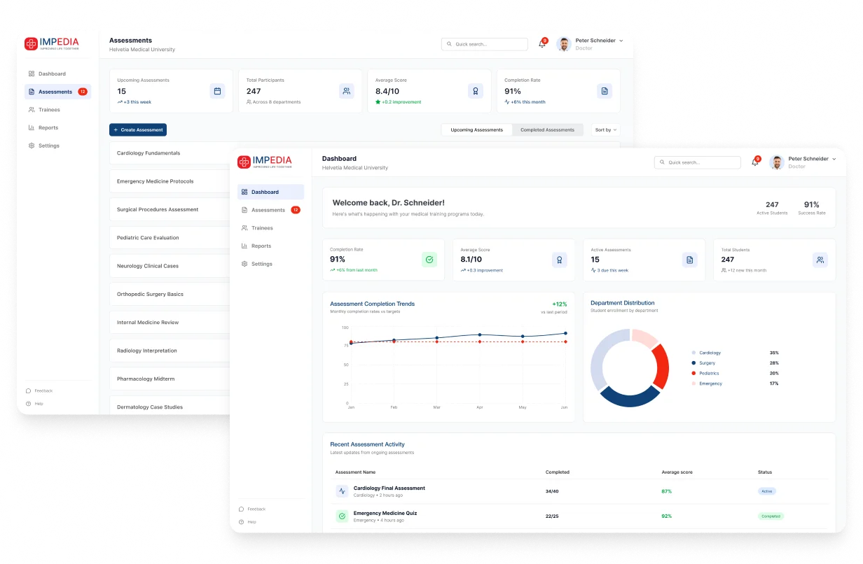
The final UI was designed to be clean and engaging. A modern design system ensured consistency across pages, while real-time updates and personalized reward views enhanced clarity and usability.
Dashboard

Assessments

Conclusion
The redesign of the IMpedia Dashboard made the platform clearer, faster, and more user-friendly. Users now save time, make fewer mistakes, and feel more confident in the process. With 50% less admin work and 40% faster navigation, the project showed how design can create strong positive impact with simple but focused improvements.
Clickable prototype
The prototype is created in Figma and you can find the link below.