HB reavis
Visitors Invitations Mobile Manager
UI/UX
Office Management
Client
Role
Industry
HB Reavis
UI/UX Designer
Office Management
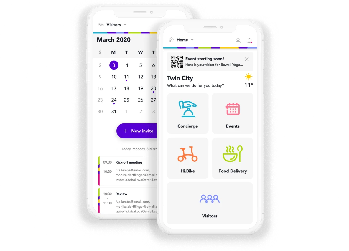
The Visitor feature in the More by HB Reavis app is designed to streamline the process of inviting and welcoming guests into HB Reavis buildings. It offers a modern, digital-first experience that enhances building security, simplifies administrative tasks, and creates a smooth and professional journey for both hosts and visitors.
Results and outcomes
- Reduced Time-to-Invite by ~50%
Through clean form structure, calendar shortcuts, and reuse of visitor data, users completed invites in under 45 seconds.
- Recurring Visits increased by 40%
Over 40% of users chose recurring invites after the feature was introduced, indicating success in addressing repeat needs.
Problem statement
Modern office buildings face daily friction with outdated visitor registration methods—manual check-ins, physical badges, and slow approvals. For HB Reavis properties, which prioritize user-centric design and efficiency, this experience needed to be reimagined.
Goals
- Make the visitor invite process fast and easy to complete invites in under 1 minute
- Let users set up recurring visits (daily, weekly, or custom) so they don’t need to re-enter the same info each time.

My design process
The design process focused on making it easy and fast to invite visitors to the office. After talking with stakeholders, I designed simple screens that support one-time and repeat visits. Testing showed the feature was clear and quick to use. I worked with developers to make sure everything worked well in the final app.
Understanding the Problem
I started by identifying key pain points in the traditional visitor registration process across office buildings. I collaborated with stakeholders (e.g., product manager, customer support, building operations team) to define the scope and user needs for digital visitor management.

Research
For this project, I worked with user research data provided by another design team. They had conducted interviews and surveys with office employees, reception staff, and visitors to understand their experiences with the current visitor check-in process. Their findings gave me valuable insights into common pain points and user expectations. Based on their research, the following key insights were identified:

User Flows & Wireframes
Guided by research insights, I mapped out two core user journeys: one-time visitor invites and recurring visitor setups. I then created low-fidelity wireframes in Figma, focusing on minimizing steps, streamlining interactions, and maintaining a clean, intuitive form structure for a smooth user experience based on HB Reavis design system.

UI Design
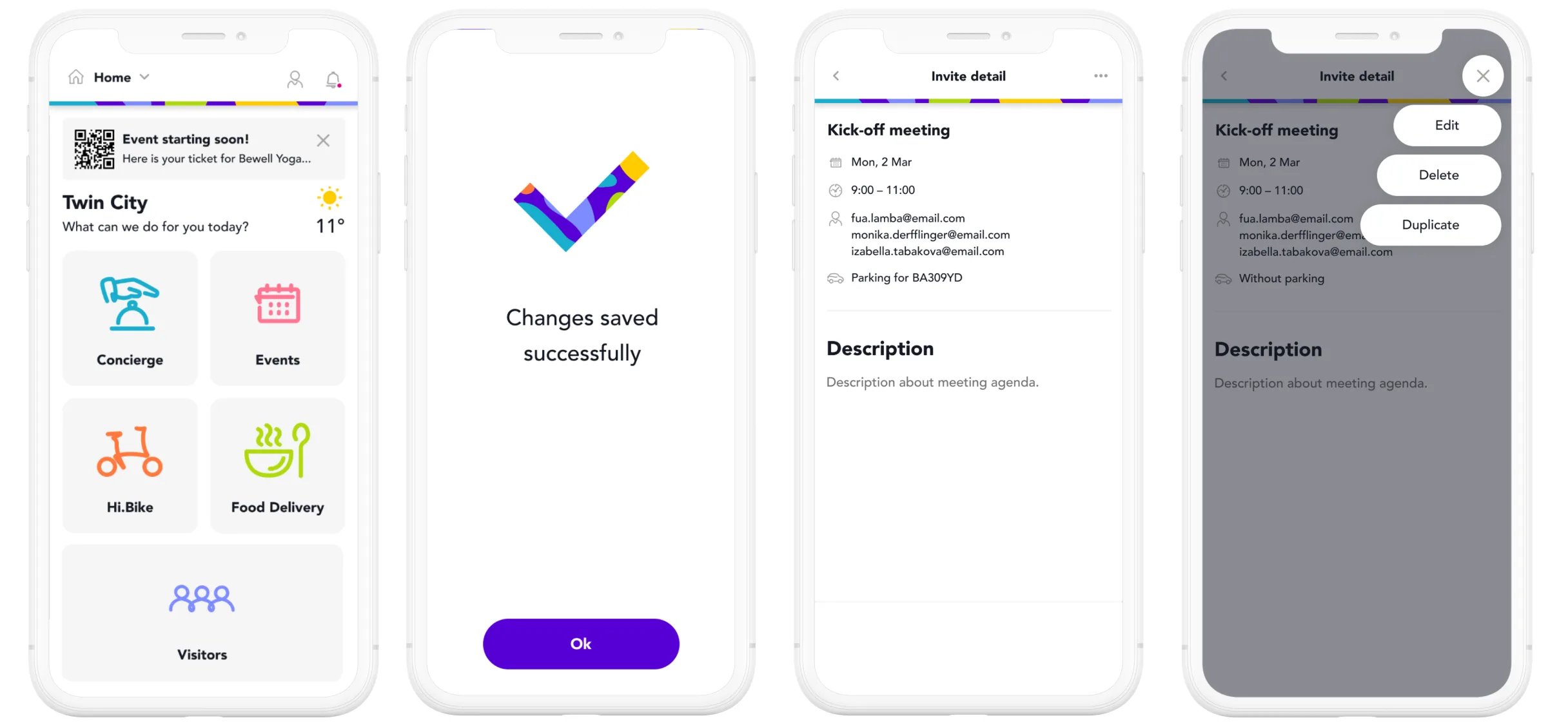
With validated flows, I designed high-fidelity screens using the HB Reavis design system for consistency. The mobile-first layout was optimized for quick input, using smart calendar pickers and a clean form structure. Visual hierarchy and micro-interactions, like onboarding and confirmation screens, helped guide users and build confidence.

Usability Testing
I ran moderated tests with 8 users from two office buildings using a prototype:
- Tasks: Invite a one-time visitor, set up a recurring visit
- Users completed tasks on average in 45 seconds
- Feedback led to small improvements (e.g., defaulting to today’s date, auto-focusing first input field)
Clickable prototype
The prototype is created in Figma and you can find the link below.